
Darkroom is the Apple design award (2020) winner. Today we will dissect their application design to figure out the best way to design a subscription based applications in 2020.
Here are 10 UX best practices I noticed in their design to maximize the conversion rate of free users to paying customers.

Get to the Aha moment as quickly as possible
Start quick, get to the point fast, no unnessasry onboarding screens!
In free to use products it is important to make the user understand how they can benefit from the product. If a user does not know how to use the product or does not understand how it is adding value there is no chance that they will pay for it.
Darkroom uses a single screen onboarding which a very unique way to onboard a new user. A single screen onboarding is not too aggressive and doesn't keep users engaged when the product cannot meet their needs but still does a great job of explaining the core value proposition. Which is simply "a new way to edit your photos".
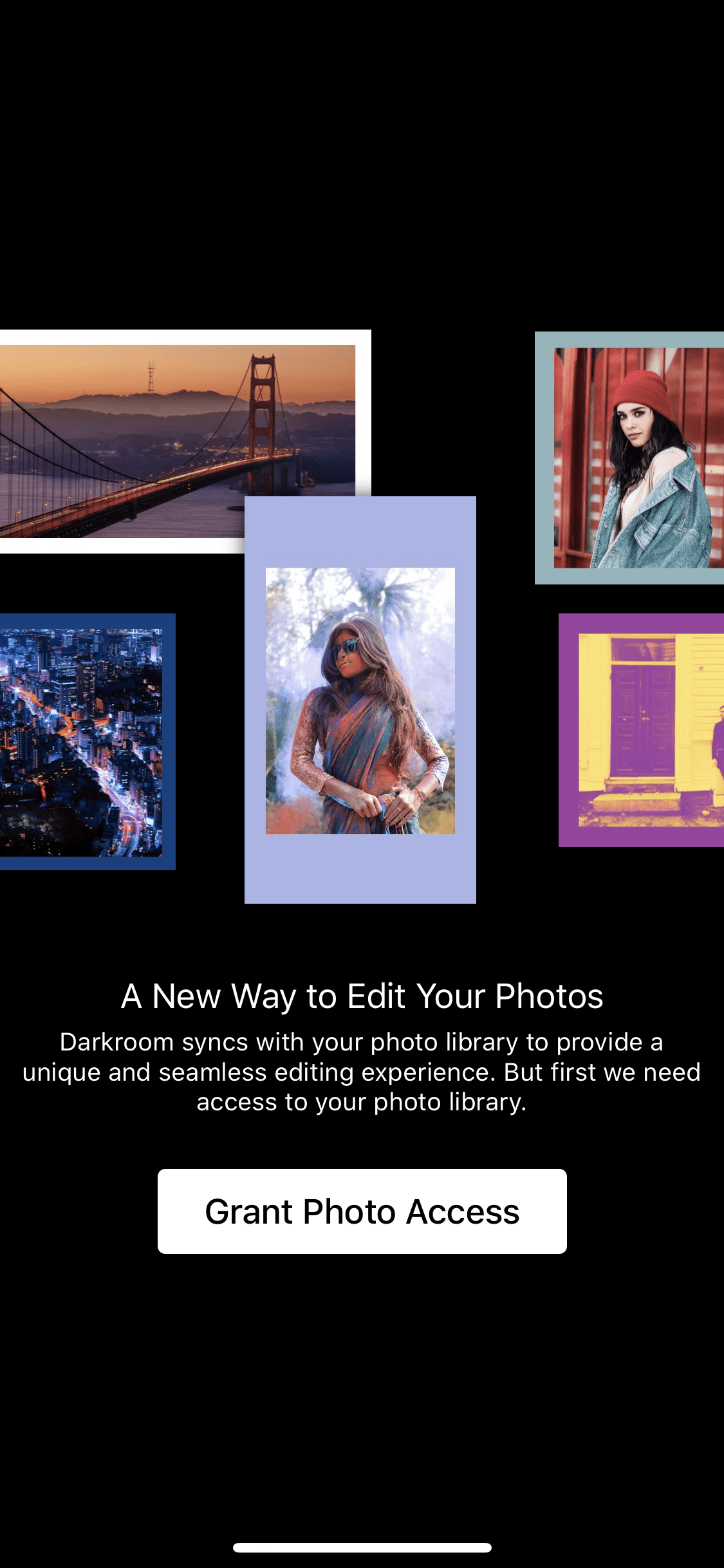
This is a very balanced way of onboarding new users and it does exactly what it is supposed to do.
Make the user rely on the product
Since free users haven't spent money they need to feel invested in the product by other means. The kinds of investments can be anything from adding a friend to spending time/effort to uploading data.
Relevant investments increase the perceived value of the product and make the user closer tied to the product, which both increases engagement and retention and ultimately increase the chances for conversion.
For Example, an empty album is a sad album
Darkroom makes the users invest in many different ways. One of the ways a user feels more invested in Darkroom is by backing up custom filters in the cloud to later use these filters in other settings.
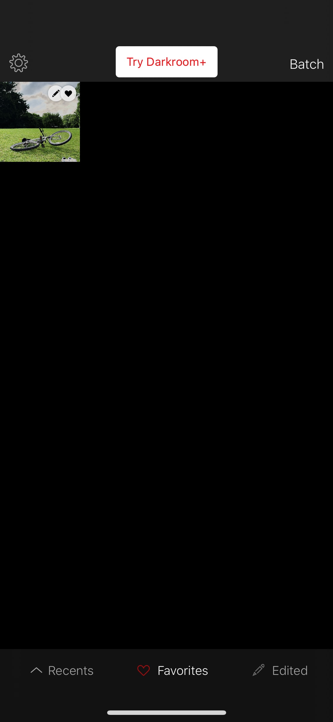
Darkroom also prompts the user to upload their photos inside the application.

A user can also change the appearance of the app and has tons of extras like an About page, Social media pages, Version history, Help center, Contact us form, which increases the trust in the company and the user becomes more invested.
Make the purchase process frictionless.
If the purchase process is too complicated the users might ignore the actual benefits of the premium functionality and ignore it completely or exit the process when prompted.
In Darkroom the option to upgrade the subscription is displayed in the header which is always there to see and very easy to approach.
Usually, this is where the logo of the app resides and it is interesting to note that upgrading a user for Darkroom is more important than their own branding.
When you press the "Try Darkroom +" button in the header, it opens a simple slider that has all the information that you need to upgrade on one page. This reduces the friction of the subscribing process.
Explain exactly what users get when they upgrade
Free to use products need to differentiate between what is free and what is premium and must present all the features clearly from the start.
It is of great importance to be sincere and inform users of limitations and possibilities with the different tiers before they start using the product.
Darkroom has one of the simplest ways of informing users of what they get out of a subscription. They do that in a sliding carousel and inform all the extras that we get after upgrading.
Have the product available cross-platform
By having a product that is runnable on many platforms, the probability of reaching out to a broader customer base is higher.
The cross-platform concept will make the work much easier for the end user. They will have the possibility to seamlessly move from one device to another, which enables for increased retention.
Darkroom has applications for iPhone and iPad but also for the Android devices. One way Darkroom can improve the experience of their users is to have a desktop version of the application.
To be continued... (read next chapter here)