Track time and maintain consistency using this new iOS notes app
The Context
Finding time and managing the demands of all the parallel threads of life, particularly aspirational goals like learning a new language or an instrument, can be difficult.
How can a digital tool help individuals better manage their time and improve productivity and focus to perform an activity? This was the goal of the project.
The Process
1. Identifying the current bottlenecks
To better understand how people manage their time (digitally or using an analog system) a set of interviews were conducted to find what works and where the improvements can be made. The following points were identified.

The interviews can be read here.
2. Highlighting the problem set
Moving forward two different types of problems were identified that the application will help its users with.

3. Considering two different types of users
Using the data collected from the interviews a thematic analysis was performed and two kind of users were identified that will benefit from the designed services.
3. Exploring current services and their short comings
Currently available services in the app stores that caters for the same user groups were identified. By exploring these services and their user reviews, potential opportunities were identified.
The productivity applications can be divided into two categories
- The applications which incorporates the Pomodoro technique for focus management. I picked PomoDo! for extensive use.
- The applications that lets you schedule daily tasks and activities. I picked Productivity Wizard for extensive use.
Anoter set of interview and diary study was setup which brought in intersting insights on how people really use these applications, from which edge cases were identified.
4. Considering all the edge cases

7. Layouts and Low fidelity prototype
Keeping in mind the edge cases a layout was drawn on paper as wireframes
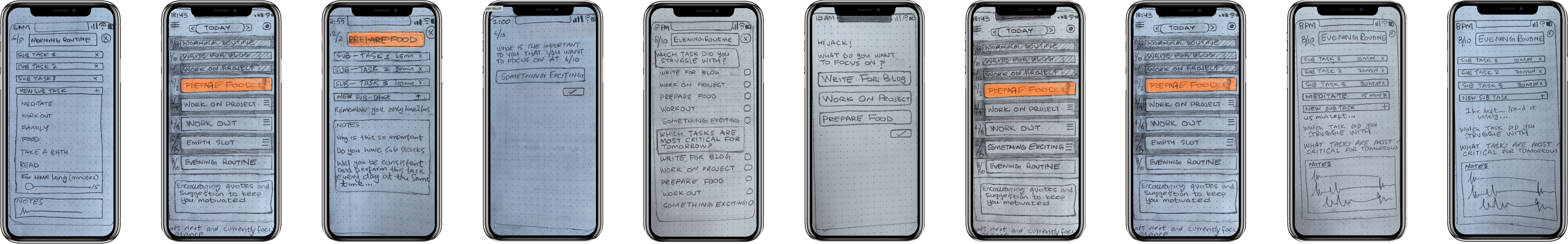
Using the wireframes a low fiedelity prototype was created
8. Early usability test and design rational
Using the low fiedelity prototype a quick usability test was performed and a survey was conducted to understand the early public sentiment to the application experience design.
A few gaps were indentified from the usability tests and the following amendments were made to the UX design:
- The design was cognitively draining (better color scheme and less options)
- Gamification aspect was missing (achievements and consistency reports)
- The main screen was too cluttered (use of carousel for activities)
- All caps letters were misleading (avoid using all caps)
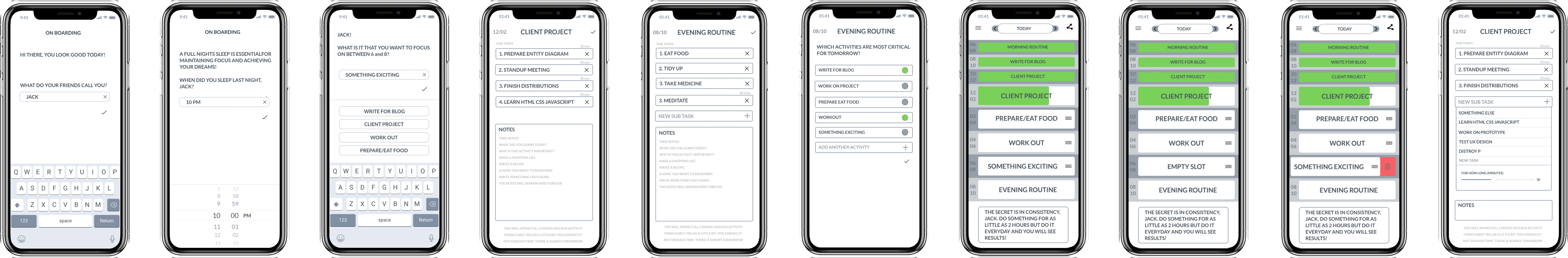
Visual Design
High fidelity prototypes
Keeping the feedback from usability testing in mind a high-fidelity versions of the main screens was designed.
A user flow was drafted to help with prototypes
Usability testing high-fidelity on test flight
The high-fidelity prototype was programmed in SwiftUI for the reason to test on end user devices for multiple days straight. Many issues were identified which weren't clear in the make shift prototypes design on Principle.
https://xtabbas.com/next-step-when-design-fails/
Flexing the sprints to be more dynamic and listening to user feedback
Keeping the feedback from test-flight usability tests, the 2 hour time slots were reconsidered, and the whole slotting system was redefined with ease of use and flexibility in mind.
Points fixed in the next iteration
- Rescheduling/deleting an upcoming task.
- Allow breaks and no activities.
- Consistency reports and recommendations.
- Adding another sprint after the last sprint.
- Scheduling something between odd timings.
- Taking pauses in the sprint.
- Removing the countdown timer.
- Create a sprint as you’re working on it.
- Create a sprint while taking a break.
- Explain the two-hour rule.
Most recent version
The Takeaway
What you learn from the project?
The major takeaway from this project was that design happen in retrospect and in iterations and in stages. I made some assumptions about the 2 hour rule which turned out to be unintuitive when tested.
How have you grown as a person?
To experience the design process first hand was a humbling and an eye opening experience. I realize you cannot cling to your design decisions and the user experience is user driven in everyway possible. Much like many other things in life, you look back and reiterate for the best results.
What would you do differently next time, if you were to repeat the project?
I would conduct more interviews and perform a thorough diary keeping activity with a set of different end users after considering the edge cases and before designing the wireframes. This will help me find the flaw with dividing the day into two hours slots earlier than I did.
What parts of the project are you most proud of, and why?
I am most proud of the fact that I didn't give up and kept researching and coming back with new ideas after the gathering the feedback. I am proud of the fact that I engaged with the audience that I was able to. I think there is potential in the core idea of this project and I will love to see it succeed on the app store.