
Want to receive post like these in your inbox? You can subscribe! It's free.
A massively collaborative design tool like Figma fixes alot of everyday problems for product teams who foster in collaborations and likes to move fast. With the benefits of having everything under one umbrella Figma also brings it's own set of challenges that are important to point out and mitigate.
For this reason, I want to share how I organize my design projects in Figma for easy collaboration between different teams, be it design, development or management, and to learn a few things along the way from you lot in the comments.
read the followup post 6 frustrations developers face with design handoffs
Before the release of Figma around 4 years ago product teams used to rely on third party softwares to collaborate. For example the team that I worked with used to define the problems sets on Google docs and sheets, share assets on Zeplin for developers, design on Sketch and communicate on Skype. Everything was spread across different channels and it was the norm.
With Figma the whole process of sharing your design files with other team members is centralized to a point that every team member can treat Figma as a single source of truth.
Figma as a single source of truth
In bigger teams where the design are always evolving you need the designers and developers to sit in the same room and work together on specific features instead of whole projects. You want the designs to be built with the understanding of the programming constraints. In these teams every opinion matter and having developers and designers collaborate from the start is important.
This is where Figma shines the most. With Figma all your research and ideas, experiments and final designs can live under one roof. You do not have to use thirdparty tools for design+dev collaboration which not only saves time but also ensures consistency and perfect translations from design to code.
Using Figma for defining project goals
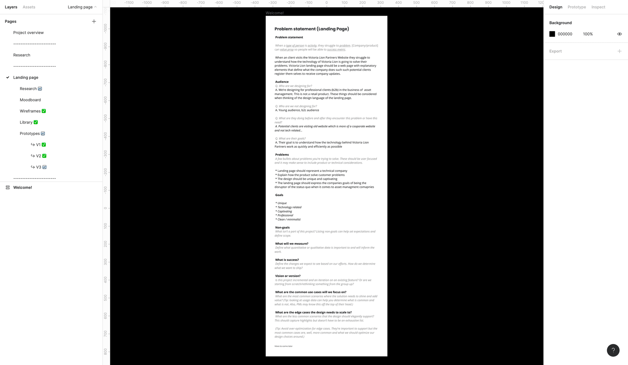
Because Figma lets anyone in a product team see the state of design at any given time it is important to treat Figma projects as a documentation of the whole product. As a UX designer you are expected to document every part of the project, from where it originate, what are the reasons behind having a design in certain way, and what are the known risks associated with a design.
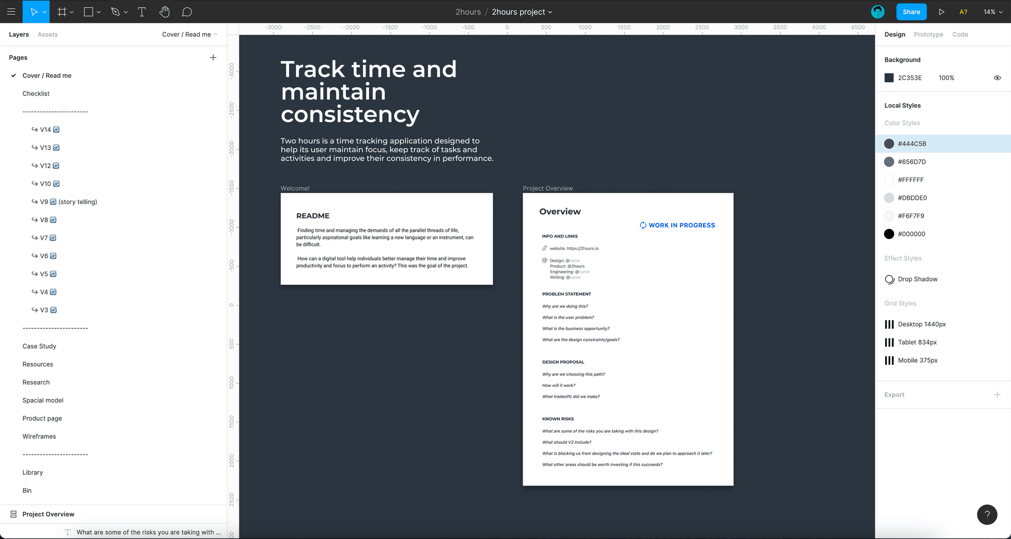
To encapsulate all these points I always start with a project read-me file while acts as a starting point for anyone visiting the project for the first time.
This page contains an overview for the project and help anyone to understand what this project is all about. For example, (1) a summary of the project, (2) a description of who is working on it as a developer, designer and UX writer, (3) why are we building this project, (4) what are the goals and (5) known risks.
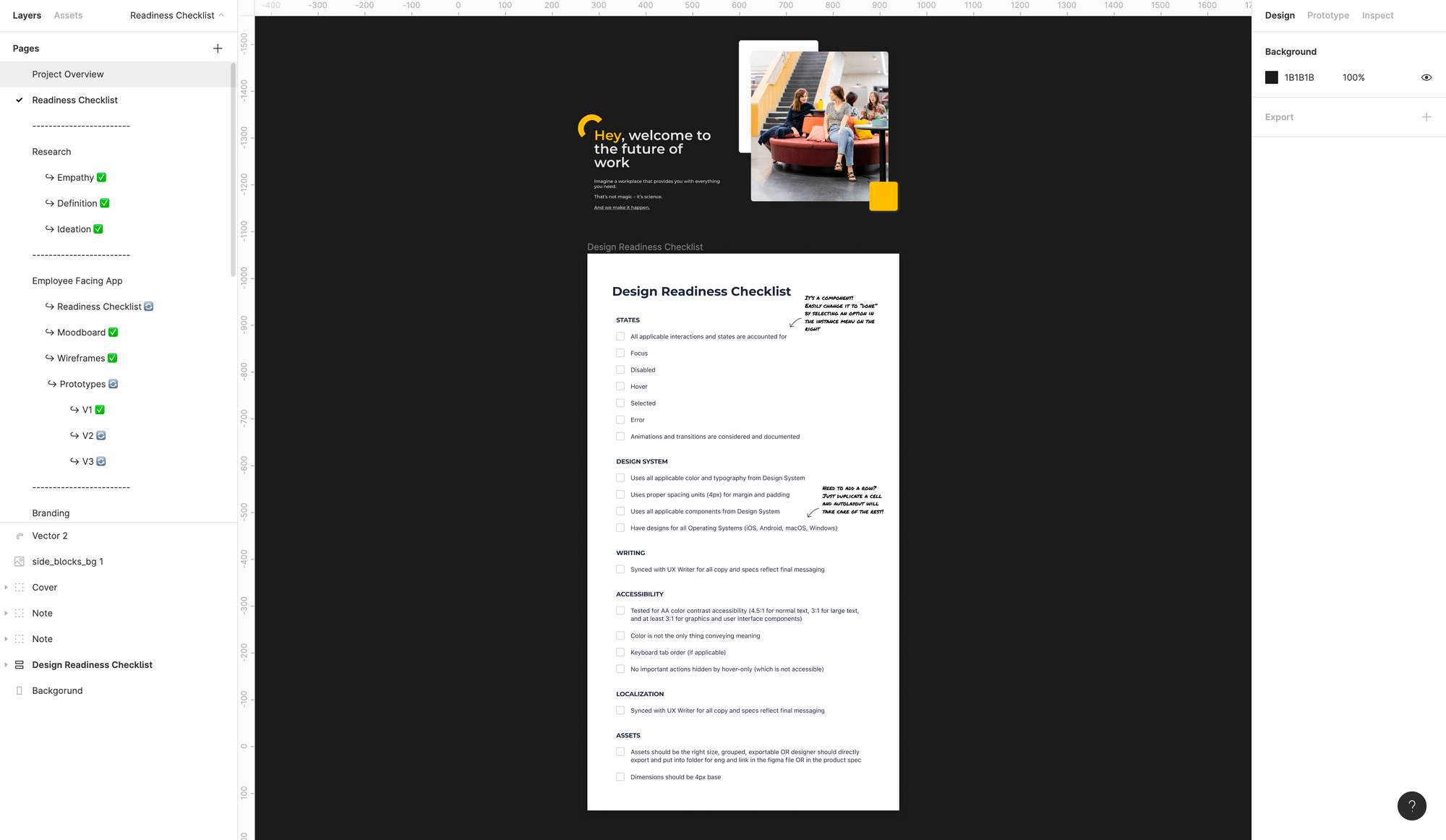
Adding a design ready checklist
Now that your design project is treated as a documentation and team members from every department are visiting it to see the state of the project it is important to include a design ready checklist next to the starting point.
A design ready checklist will include different checkpoints, for example, (1) if all applicable interactions and states are accounted for, (2) if design system encapsulate all the applicable color and typography, (3) if accessibility or localization is accounted for, etc, and will indicate how far away a project is from completion.
A design checklist that encorporates items like mobile design, error design, warning design etc helps the team understand if the edge cases are taken care of or not. The emphasis here is in planning to execute. This help you and your team keeps track of what is in progress and what is left to be done to call a design as complete.
Organisation and structural integrity for pages
To organise the pages into seprate blocks help seprate the concern and organize different pages into separate categories. For example the research pages come under one category, the iterations come under another and the introductory pages come at the top. What I use to seprate these pages is a "-------------" marker which helps anyone exploring the project for the first time to reach where ever they want to go without wandering around and wasting time.
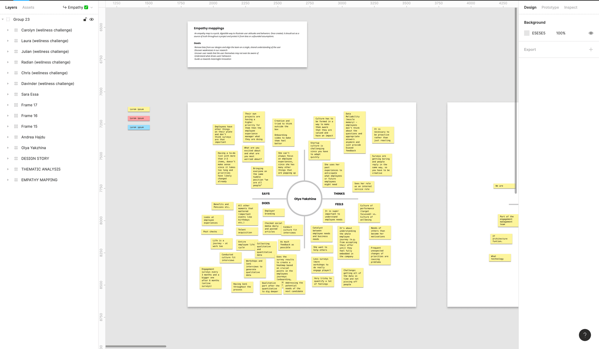
Figma as a UX research hub
This is where Figma gets really powerful. Instead of defining your research in third party tools like Miro or Marvel or other card sorting tools, keeping all your research data under one root makes it much more approachable and easy to explain to the stakeholders.
This allows everyone to be on the same page and research findings are easier to explain and encorporate in your design.
Using Figma to define sitemaps and user journeys
Defining site maps and user journeys is important to not only make sense of how the screens will interact with each other but also to explain and make sense of the UX in front of other stakeholders.
For the later part, having your user flows under a single project let's every see it, which means before explaining anything your team will already have an idea of what to expect, which can save lots of time and effort.
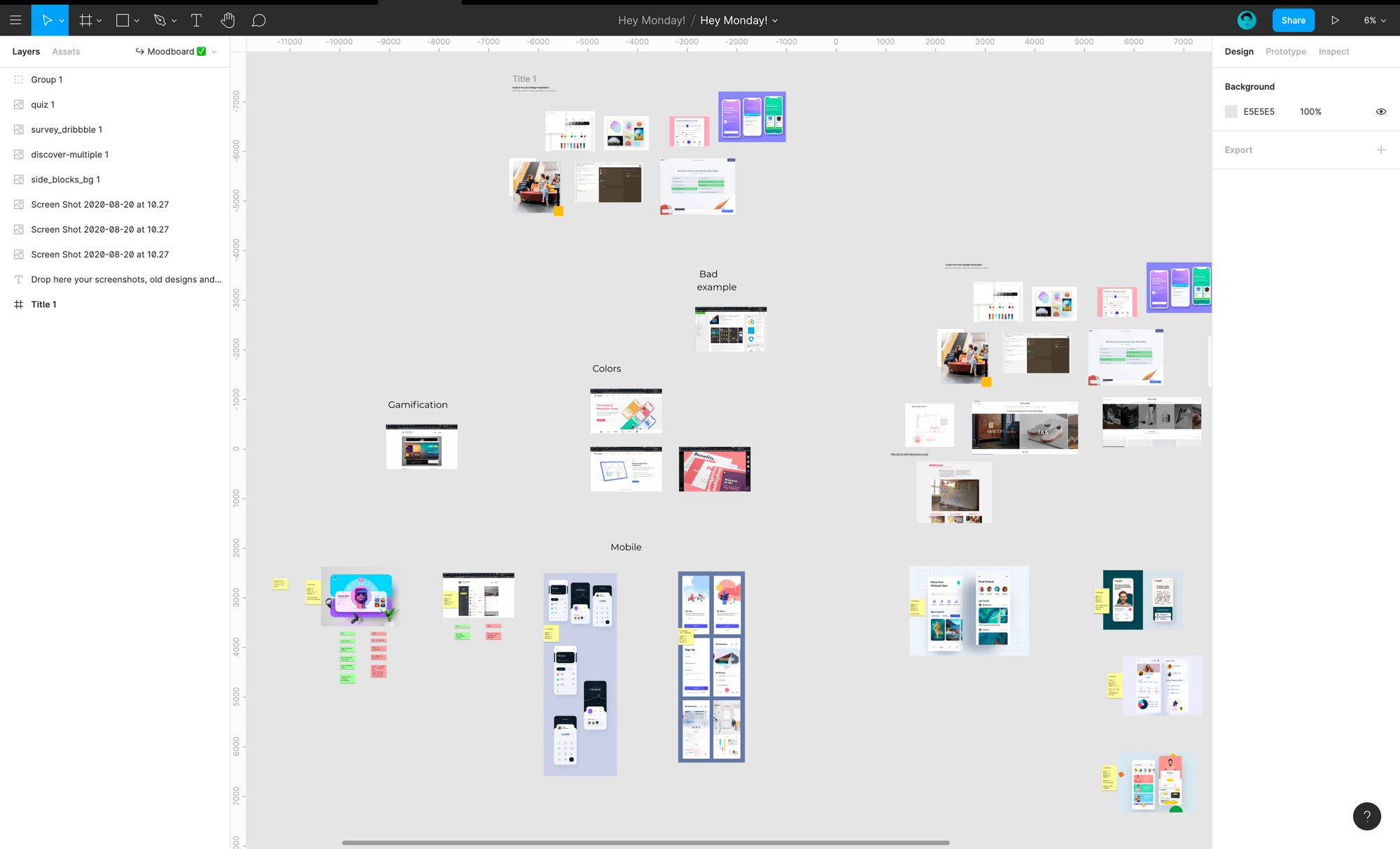
Using Figma as a moodboard and a place to gather inspiration
If you're familier with UI design or any kind of design than you will know that gathering inspirations and defining the mood of the project before any designing effort dictates how well your project designs are going to turn out.
Using Figma I like to embrace this fact and use a "resources" page to gather all my design inspirations for the project for anyone to see. This helps other designers understand where a design idea is coming from and where it can go next.
Encouraging experiments and free flow design using Figma
Before moving to designing a presentable UI, I like to experiement and design what ever comes to mind without worrying about what others might think of it. For this, I use a seprate page and call it "experiments".
This helps avoiding any confusing with the rest of the team and gives a way to channel creativity without the fear of judgement, which works great for someone who never gets a design perfected in the first try.
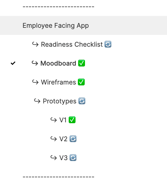
How I like to iterate UI design in Figma
Designs are done in iteration and if you build a process that encorporates and encorages iteration from the start you are bound to build a successful solution for you company.
To iterate in Figma I like to put a time stamp to a file which acts as a screenshot in time. Next I also put a refresh emoji in the page name to let everyone know if this design is in progress such that developers don't get confused on what is ready to be implemented.
When a design is ready to be implemented in code, I replace the refresh sign with a checkmark to separate work in progress from work ready to be shipped.
Figma as a design scrape yard and why you should never delete anything
With Figma, I also like to create a bin page where all the designs that doesn't make it to the final cut go and rest in peace. I do this becuase you never know when a design idea can come in handy. If not in the current project than in any other project in the future.
That is pretty much it for now, thanks for reading and if you're interested please let me know any tips and tricks that you know of on Twitter.
read the followup post 6 frustrations developers face with design handoffs