Sometimes, or rather alot of the time, when design something, the first iteration will almost always suck. You learn alot designing things and design is hard, which makes you humble if anything else. This happen to me recently when I designed a productivity application, and I thought something would work, but it didn't when the prototypes were tested out in the public by potential end users.
What went wrong
I designed a producitvity application and half way through, the theme of the app (as I interpreted from the user research) turned to be something which involes dividing the day into 2 hours chunks.
While usability testing earlier prototypes instead of commenting on this core feature, the test users requested/suggested other points which I decided to add in the application design. I expanded the scope without thoroughly evaluating the basics.
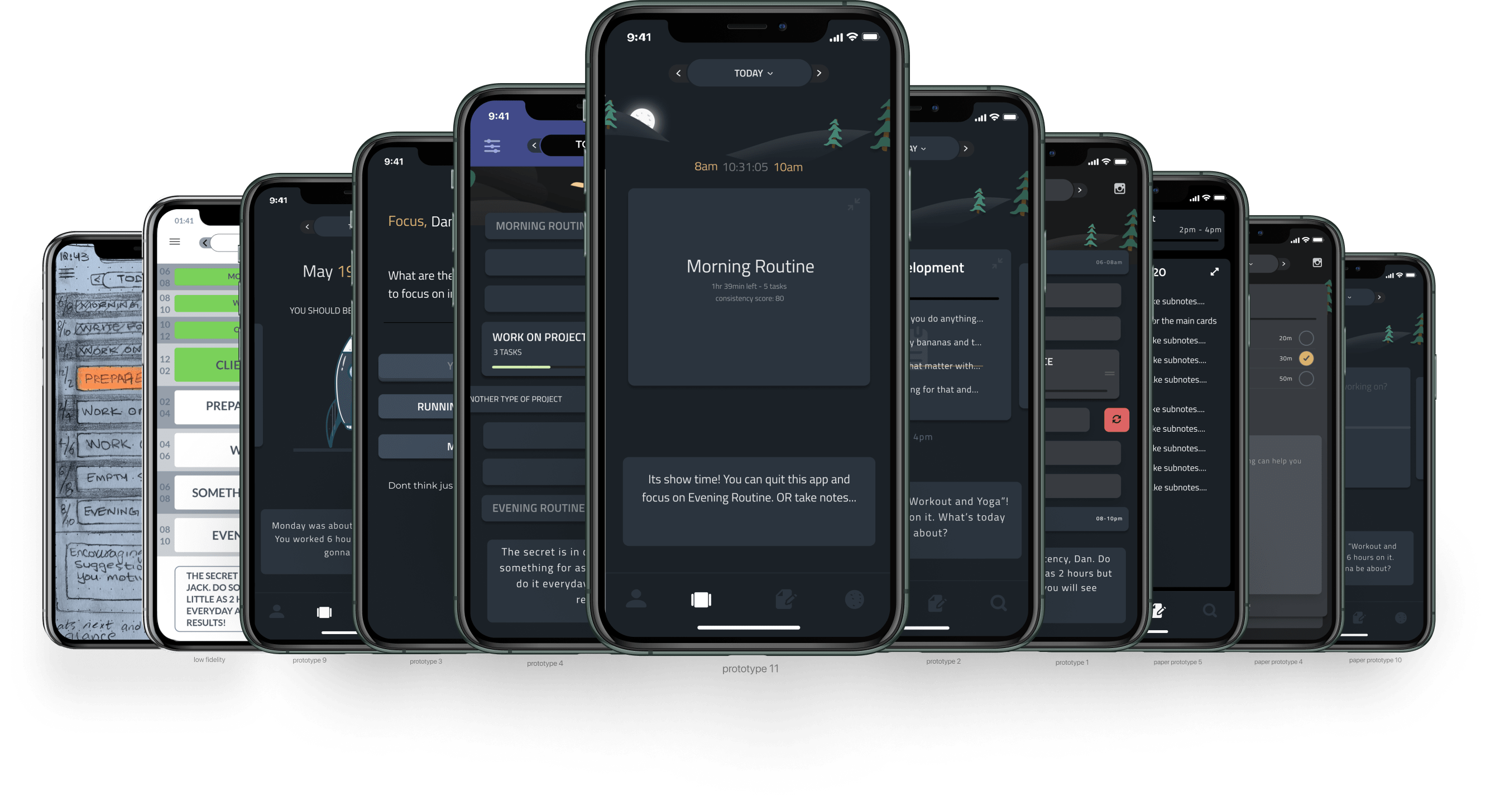
Adding more features was proven to be a big mistake when an MVP was distributed via test-flight. I found the core of the UX has flaws which needs addressing. All the extra features were confusing the user.
Feeling miserable is a part of the process!
Looking back at your mistakes is the worst and the best part about being a user experience designer / developer. This is when I found Danial Gauthier’s blog.
Dan said what I needed to hear
- Cut the scope ruthlessly and focus on the minimum.
- Build your core interaction loop and tune it before anything else.
I wish I stumbled on this advice a few months earlier which would have saved time.
The principle of retrospect
The silver lining here is that design is an iterative process. I remember reading one of Tuhin Kumar's blog on great designs in which I read
“Great designs are usually the result of a lot of trial and error, missteps and blind alleys, and hard work and deep thinking… No one gets it right the first time.”
http://tuhin.co/great-designers.html
So now what?
Now that I made something which doesn’t work, Tuhin's blog is starting to make more sense. Now is the time to look back and understand the user feedback to identify and fix mistakes.
To be honest, I have no idea if I am going will be successful in finishing the project in time or at all, but I know where I made the mistakes and where the design needs to improve.
For example, here is the feedback collected from the users which I am going to work with next
Feedback from usability tests
- What happens if I spend more than 2hours on an activity?
- What if I want to work on something for 1 hour or maybe less?
- What if I want to take a break and pause the activity for a bit?
- What if I am not working on an activity that I planned and would like to reschedule?
- What if I want to customize the time and work on something between let's say 11 and 1?
- What if I go to sleep later than the app thinks I will and have 6 hours of sleep?
- I didn’t know if I was supposed to swipe the cards at first glance.
- There weren’t enough reports about consistency or positive feedback loop.
- I don’t understand the 2hour sprints… why two hours?
Here are the major points I will consider in the next iteration
Points to consider in the next iteration
- Rescheduling/deleting an upcoming task.
- Allow breaks and no activities.
- Consistency reports and recommendations.
- Adding another sprint after the last sprint.
- Scheduling something between odd timings.
- Taking pauses in the sprint.
- Removing the countdown timer.
- Create a sprint as you’re working on it.
- Create a sprint while taking a break.
- Explain the two-hour rule.
Next step
The fact that I didn't go as far in the initial discovery phase as I shoud have has merits. After the interviews and initial ideation a prolonged diary study with different type of potential users would have helped in answering most of the questions I got from users who tested the on device prototypes.
However, since creating on device prototypes is an interesting frontier because of new tools like Figma and SwiftUI the end results and the concluding remarks on the design were the same. Which made it a fun, leaning journey in the end.
The final take away is the end goal of the product is much clear now which is about "finding a way to track and manage the demands of all the parallel threads of their life, particularly aspirational goals like learning a new language". I am looking forward to the final product when it launches end of August 2020. If you want to test a beta send me a DM on Twitter and I will invite you on Apple's test flight program.
Thanks to poodleface and many others for their interesting insights on the topic.